What User Onboarding really is!
User onboarding, simply put is the process of introducing new users to your product. It is a series of interactions or instructions that guides a user to make their product experience easy. Samuel Hulick of useronboard.com explains this concept using the ‘Super Mario’ analogy that the best way to win customers is to not just list the awesome features of your product but also show how easy it is to use your product.
A key aspect of creating an effective user onboarding experience is thoughtful UI/UX design. This ensures that the interface is not only functional but intuitive, providing users with clear visual cues and a smooth navigation path throughout the onboarding process.
Let’s consider another example. Imagine you got a new skateboard for your son. The success factor here is when he learns to board properly with minimal help. So, when he starts off with the boarding, you give him few tips and guide him on how to put his foot on the board and after setting it firmly, with the help of other foot push the floor and move forward.
In the context of “user onboarding”, the skateboard is the product your kid signed up for and after signing up he is taken through a great onboarding process that teaches him how to use the product. Eventually, he gets the hang of it and is good to go on his own and explore its capabilities.
A “user onboarding” process for a product doesn’t just stop there, it also involves providing help over calls and emails, documentation, and engaging with the customer support team of a product.
Here, measuring the customer experience KPI is crucial to ensure that the onboarding process is effective and continuously improving.
Mistakes in User Onboarding
Below are five common user onboarding mistakes and how they can be avoided:
-
Complex and confusing interface – use familiar and well-known symbols in the interface. For example, use a “+” icon to add something, use green to associate with “yes”, and red to associate with “no”.
-
Missing onboarding – The first acquaintance with the app is the most important for a user. Take the user by the hand and show them the capabilities of the app, step-by-step. Show them a workflow or a progress bar to indicate which stage they are in, for a task.
-
Inconsistent UI – Do not use different fonts and styles in the UI and do not make the UI very colorful. Stick to a style so that the user gets used to one style.
-
Too much information on the screen – Don’t be desperate to show the user everything at once and risk creating a crowded screen.
-
Too many annoying notifications– No one wants to read the same notifications repeatedly. Excessive use of notifications can be very distracting.
Is there a “best” user onboarding experience for a product’s UI?
The answer to this question depends on who the user is and the product’s ability to satisfy the user’s experience through the product’s front door. A product alone doesn’t excite customers. It is the user experience that comes along with the product which becomes its selling point. So, most of the web-apps now requires both a user experience and user engagement model which in turn becomes a driving factor in user retention.
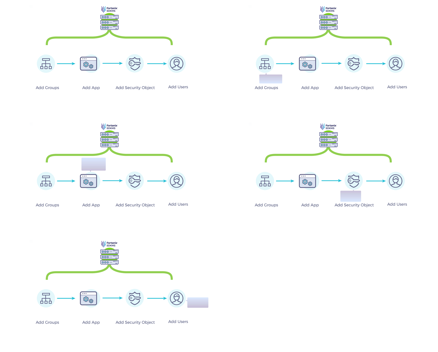
This can be achieved using “learning by experiencing” and the introduction of in-app interactive walkthroughs which ensures a user understands the value of your product. The Fortanix DSM UI has this capability – its guided walkthrough and simple UI helps new users navigate through the right places in the Fortanix DSM interface and grasp the steps quickly and effectively.
“What we have to learn to do, we learn by doing.”
— Aristotle
The method of guided task completion prompts the user to interact with the product and helps familiarize them with the menus, controls, and other aspects of your product straight away. It also is useful for users when this kind of onboarding can be skipped when desired.
Fortanix DSM Guided Walkthrough
The Fortanix DSM UI walkthrough helps create an ideal experience for a user to get onboard and learn how to use the product and its features. It engages and prompts them at every stage to perform the next step in the workflow, such as to create a “group”, add an “application”, and create “security objects” (including cryptographic keys). The Fortanix DSM walkthrough seamlessly fits into the background and only helps exactly when needed. They appear as a tooltip that highlights elements in the Fortanix DSM UI that prompt the user to take an action.
“Shipping an application with a guided walkthrough is like selling a product with a manual.” – Cesare Rocchi, Speaker, Writer, UX designer for Web and Mobile apps.
The Fortanix DSM UI’s effectiveness in reducing confusion, and ability to streamline onboarding is working well with customers. Request a demo to experience it!

 Cite this article


